This article is a demo of Story’s image-related features (other than figure captions). Story can apply a variety of stylistic and layout transformations to your images. These features are enabled by unobtrusive, accessibility-friendly tricks that give you more control over images than Markdown typically provides. Story also has out-of-the-box support for header and preview images, for a visually stunning site.
Shrinking Large Images
Story’s CSS automatically shrinks images to fit into the width of the article.
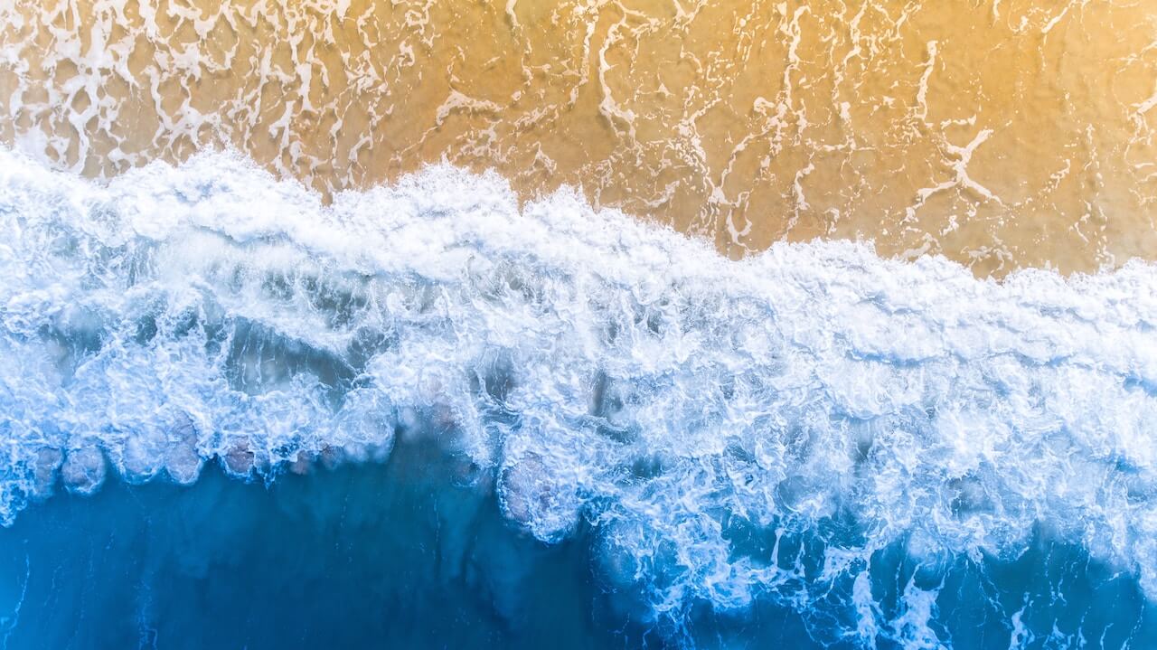
The image above is much wider than the content region, but it’s sized to fit.
Control Over Image Formatting
Story uses URL fragment techniques to give you control over image styling. Images that use this technique don’t get converted into figures with captions.

For example, you can float an image right with the fr URL fragment:

There’s a selection of these pseudo-classes built into Story via the Descartes CSS file; inspect the CSS or LESS source to see what styles you can attach to images.
If floated images interfere with headings, you can use heading clear feature flags to fix this.
Book Cover Mockups
A book cover image that’s inside an <a> link can be floated right and given
a 3d look with the 3dbook URL fragment pseudo-class.
[](https://unsplash.com/photos/vHnVtLK8rCc)
Header Images
Story is designed for visual impact, with a featured image for each piece of content.
Use the image property in the article’s front-matter to set the image.
Use the credit to give credit to the image’s creator if you wish; Story will put a small camera icon in the header if it finds that parameter.
Use the thumbnail property to supply a smaller version of the image in list views.
A typical piece of content will have front matter like the following:
image: "/img/unsplash-photos-QRkew0KwXSM.jpg"
thumbnail: /img/unsplash-photos-QRkew0KwXSM.tn-500x500.jpg
credit: "https://unsplash.com/photos/QRkew0KwXSM"
If there’s no thumbnail, Story falls back to the full-size image.
If there’s no article-specific image, Story uses its default, /img/default-header-img.jpg, or the thumbnail equivalent, /img/default-header-img.tn-500x500.jpg.
This page doesn’t supply its own header image, so Story is using the default.
You can supply your own default header image by simply putting an image with the same name in your site’s /static/img directory.
If Hugo finds that you’ve added an image of your own, it will take precedence.
You can also override section-specific header images in list
(non-individual-page) views with parameters in the _index.md content file in
that section. (The title and subtitle parameters in those files can also
override what’s shown in list page headers.)
Imageless Layout Options
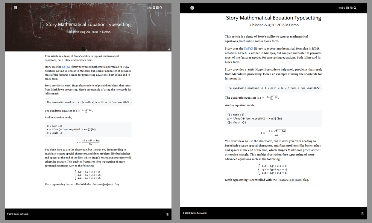
If you don’t want header images or preview thumbnails in list views, you can set
the feature-nohdr feature. Set locally in a piece of content, it will display
no header/banner image. Here’s an example of what a page looks like with and
without the header image:
Set globally for the whole site, it will make the site simply ignore all header and preview images:
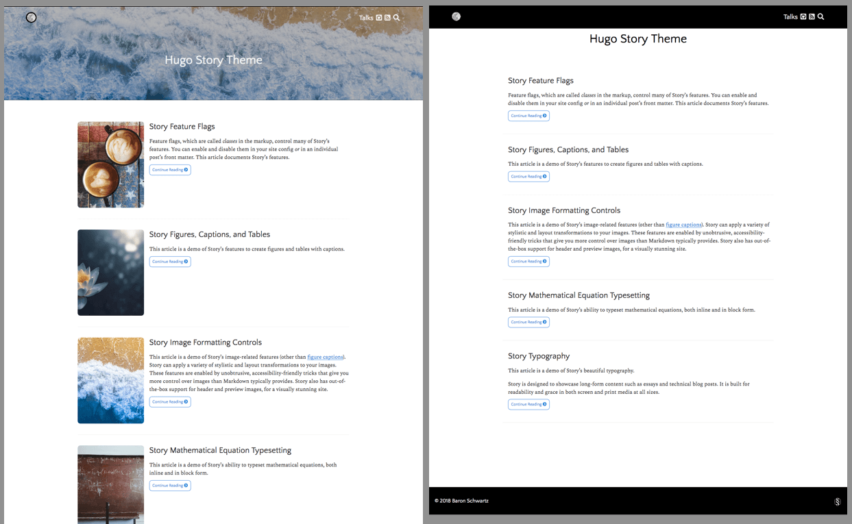
To illustrate this feature, the search page has this feature set, so it has a plain, bannerless layout.
Adding Depth To Headers
Articles (but not list pages) can be given a bit of extra depth with the
feature-depth class, which is negatable with feature-nodepth. This article
is an example: notice how the content is shifted up slightly to overlap the
header image a bit, with rounded corners and a shadow around it.
The feature-depth class can be set globally in your config.yaml or similar,
and overridden as you wish on individual pages.
Read next: Story’s built-in search features.

